Whitney High School Red Cross Club
Produced on:

Overview
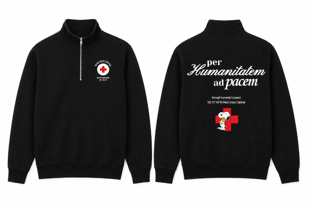
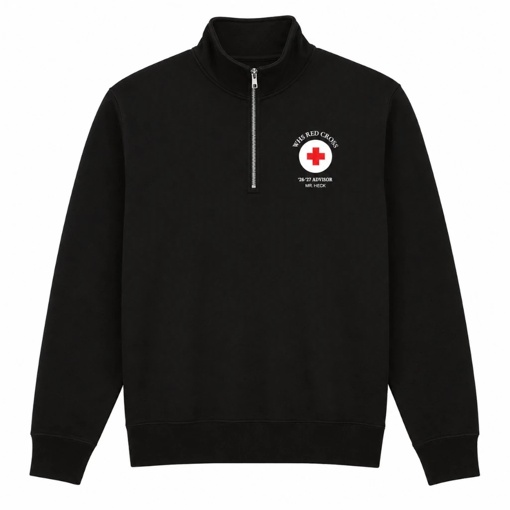
The message on the back is worth stopping to read. Per Humanitatem ad pacem sits above a red cross, with through humanity to peace below it. On Whitney High School Red Cross Club's black quarter-zip, the Latin and English give the same idea two voices. The front brings it down to the individual: a member's name and cabinet role, alongside the club identity. That is the heart of this piece. A broad humanitarian purpose becomes something attached to a particular person, someone choosing to give their time. The red cross supplies the color, while the black fabric gives the names and message a clear place to live.
Want something like this?
We'll open a quote on the same path, then confirm styles, quantities, and pricing in writing.
Bring this reference into a short enquiry. No exact products, quantities, or artwork needed yet.
Keep exploring
View all projects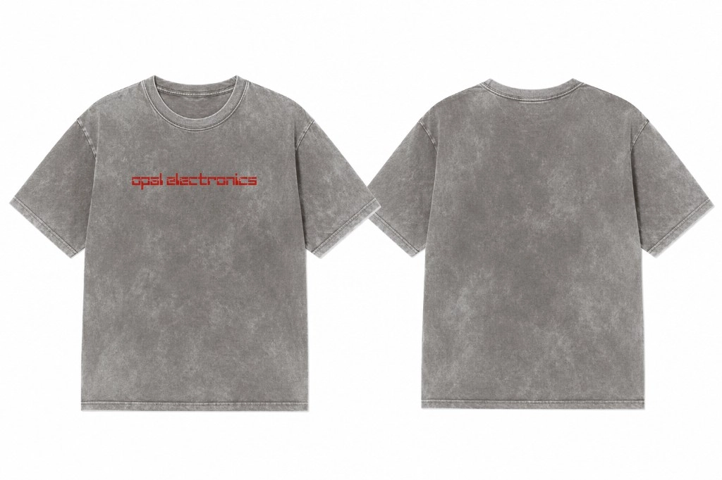
Opal Electronics
The charm is in how little it needs. A red digital-style wordmark and a mineral-washed gray tee give Opal Electronics a team piece with the look of an old favorite.
View case study
screenpipe · YC S26
Same little pipe, two ways to wear it. screenpipe's white tee and dad cap make an easy pair, with a black icon that gives each piece a clear connection to the team.
View case study